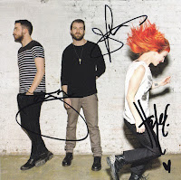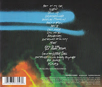
Paramore's digipak for their album presents their band as energetic and youthful, to appeal to a teen audience and fans of the rock genre.
The bright colours throughout the digipak present the creativity of the band's music to their audience, as well as present it as energetic and exciting, like their rock concerts, which is possibly what they are trying to portray to catch the attention of young and energetic audiences looking for something exciting to listen to, as well as rock fans. Other aspects used in this digipak to appeal to rock fans are the grungy elements to the images and text, such as the dirty wall in the background of the middle panel and the spray paint on the disk and back panel. This aesthetic appeals to rock fans as an identifiable characteristic of that genre, as well with the energy from the colours and the dynamic, energetic poses, especially on the middle panel. And this comes together to create a feeling for the music inside, that it is creative and exciting, which is appealing to teen rock fans.
The creativity presented in the colour and handwritten font helps to separate this band from other rock artists, to create a style for the band and to appeal to audiences looking for new and different within the rock genre, so appeals to specific personality types and audience interests as well as demographics.
 Another element of the digipak which helps appeal to the band and album's target audience is the choice to use the band members, which appeals to people who are already fans of the band. In addition to this, the signatures in the middle panel of the digipak add to the appeal of the bands existing fans, as it would for any artist. The digipak also creates a sense of aspiration in the same way that their music videos do for young people, as young people are able to relate and aspire to be like this young, successful band, and these people are likely to buy the album because they see something they want to aspire to, and that they can relate to. In this way, the band is appealing to teenage boys as well as girls.
These elements to attract certain audiences come together to form an identity for the band and to appeal to specific types of people by illustrating the genre of the music inside, as well as what puts it apart from other rock albums.
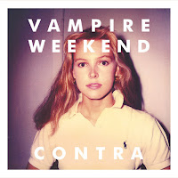
 Vampire Weekend's digipak for their album 'Contra' appeals to a more niche audience than Paramore's digipak, as it includes elements of the indie genre and the rock genre, meaning it is a more specific genre than Paramore's album.
  The digipak presents the band as indie and niche, by choosing to use a retro style image for the cover, possibly appealing to an older audience, or a younger audience who like retro aesthetics, such as the low quality image on the cover. It appeals to a young audience more than an older audience because it's mixed with clean, sans serif fonts, which are bold and white, possibly representing youth and appealing to a younger audience. The image in the style of photographs taken on an old camera with the other aspects chosen for a teen or young adult audience creates a niche style to appeal to a niche audience. An audience which would probably prefer indie
 music.
In addition to these aspects which create the band and album's style, the band has chosen to use an image of a woman, instead of the band with pink and yellow, quite feminine colours. This could be to appeal to a female audience, or to use the cover image to stand out and be different, like a lot of indie artists seem to aspire to do, which is also on the back panel of the digipak, which separates the letters to fill a fixed space on the panel, and makes it look a bit dynamic and different. This genre characteristic presented could appeal to fans of the indie genre, as well as rock fans looking for something different, as the album has rock elements and displays characteristics on the front cover of the album, such as the dynamic pose. These features of Vampire Weekend's digipak come together to appeal to a niche audience of young indie rock fans who also like retro aesthetics.

No comments:
Post a Comment