a)
b)
c)
d)
Monday 16 April 2018
Thursday 12 April 2018
Wednesday 11 April 2018
Q3. What have you learnt from your audience feedback?
To gather audience feedback, I used 'Google Forms' to easily create a questionnaire with a variety of answering options, with open and closed questions to collect both quantitative and qualitative information from 11 people, some fitting my target audience, and some not. This was to gather a variety of opinions, interpretations and thoughts from people, as well as to collect data from my intended audience.


It was useful to see what the respondents thought the target audience for the video was. All of the respondents picked between 15 and 22, mostly 15 and 18, a young, teenage audience. This shows that the viewers think that the video is suited to a younger audience, which means that the elements used to appeal to a teenage audience were successful.

These questions were to find out how the audience interpreted the story and what stood out to them, using open answer questions to gather more insightful information than a closed and possibly leading set of interpretations for the respondents to pick from.
 Stuart Hall said that people interpret texts in different ways, even if one message is portrayed, not one understanding will be reached. This can be applied to my music video as a media text, as while the message of the music video was clear, because of the similar results to this question, the interpretations are slightly different. Some people have interpreted the video in ways I hadn't thought of, this is also why I made this an open answer question. The interpretations are similar across different demographics of people, meaning that the message is clear. Most people understood that the video was about relationships as a basic theme, however some people interpreted the video, more specifically, to be about moving on and loss.
This question I asked in two parts, what the respondent's found most memorable about the music video and slight elaboration, keeping them open questions to prevent leading answers and letting people write what they felt about the video.


 For this question, I provided a few statements for participants to agree or disagree with to find out what people thought of the story, characters and quality of the music video. Most of the respondents 'strongly agreed' that the song fit the genre of music the song was, of which most people thought was indie, then rock, meaning that there were enough characteristics of the genre of the song to suit the song. Some people were unsure whether it did (yellow), which either suggests that these people are unfamiliar with the genre they picked in the previous question asking to say which genre of music the song fitted, or that they can't find any obvious genre characteristics in the video, which could be positive or negative, and according to Stuart Hall, people will understand media differently.
 The results were a bit more mixed for the questions regarding the relatability of the video, which is understandable as a few of the people who completed this questionnaire weren't part of the target audience and may have found it difficult to connect and empathise with the character and her story, this is shown by the fact that the participants related more to the story than the character. But mostly it's positive, which shows that there is some emotional connection to the character and story from the audience, and that the aspects in the video such as using a character similar to the target demographic in a fairly normal situation has worked in creating at least an understandable or relatable music video.
 The responses to the statements regarding quality and enjoyment were very positive, with only one person disagreeing that the video kept them interested throughout (green). No one found the video unclear in terms of the narrative, which is also suggested in the previous question asking about messages and themes, so the music video was easy to understand, and most people found the video interesting to watch, likely because of the quality of the product, the visuals a
 Lastly, I asked the participants to select words out of a list, or add their own if they wanted to, to describe the video the way they felt. This was to collect information about how the viewer feels about the video, as well as whether they think it is a quality product or not, by providing them with a range of both positive and negative words to choose from. On of the most common choices was stylish, which tells me that the participants thought of the video as a quality product, especially as 4 of the respondents said it was professional and 6 people found it interesting. 8 people chose stylish and 8 people also chose youthful, which could also show that the video is well suited to the target audience of teenagers. Overall, the feedback from this part of the survey was mostly positive, with one person picking a negative option 'generic', which could be interpreted to imply that the video is only generic because is displays genre characteristics, or the concept and elements of the music video has been done many times before, but I can't be certain because of the information being quantitative, which is a down side of this method of collecting information.
  One specific response was the perfect target audience for the music video, as they said they were female, between 15 to 18 and liked pop and indie music. In the question asking for the participant to read the statements and say whether she agreed or disagreed with them, she agreed that the video suited the genre of the song, the genre of which she is likely to know about and possibly be more critical of as it's a music genre she said she was interested in. The participant answered that she found the main character and the story relatable, showing that my music video may be suited to the intended audience. She also picked out the word 'relatable' as something which stood out about the video for her, from the list of words provided in a later question. This shows that the video was well received by the intended audience, and that the target audience was able to connect with the main character and the story, probably as well because this person found the story easy to understand and interesting, which would make the story and the character easier to relate to. It was also useful to know how this person interpreted the video, being in the target demographic with music genre interests similar to the genre of my chosen song. Her responses suggest that the target audience is able to understand the basic themes and messages of the video, which they are able to relate to, as well as find memorable and interesting.
Overall, the survey provided useful and interesting insight about my music video and what the audience sees in it. The participants and target demographic responded very positively overall, with different people finding different aspects of it interesting and memorable, such as being able to relate to aspects of the video or finding the visuals pleasing to look at. The responses suggest that the video is successful in catering for the intended audience and the genre of the music. The answers for questions regarding the quality of the product are also very positive, as people found the story clear and easy to understand, as well as professional looking and stylish.
Monday 9 April 2018
How do digipaks of two artists appeal to their target audiences?
Paramore - Paramore

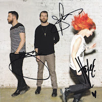
 Another element of the digipak which helps appeal to the band and album's target audience is the choice to use the band members, which appeals to people who are already fans of the band. In addition to this, the signatures in the middle panel of the digipak add to the appeal of the bands existing fans, as it would for any artist. The digipak also creates a sense of aspiration in the same way that their music videos do for young people, as young people are able to relate and aspire to be like this young, successful band, and these people are likely to buy the album because they see something they want to aspire to, and that they can relate to. In this way, the band is appealing to teenage boys as well as girls.
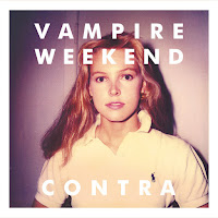 Vampire Weekend's digipak for their album 'Contra' appeals to a more niche audience than Paramore's digipak, as it includes elements of the indie genre and the rock genre, meaning it is a more specific genre than Paramore's album.
 The digipak presents the band as indie and niche, by choosing to use a retro style image for the cover, possibly appealing to an older audience, or a younger audience who like retro aesthetics, such as the low quality image on the cover. It appeals to a young audience more than an older audience because it's mixed with clean, sans serif fonts, which are bold and white, possibly representing youth and appealing to a younger audience. The image in the style of photographs taken on an old camera with the other aspects chosen for a teen or young adult audience creates a niche style to appeal to a niche audience. An audience which would probably prefer indie
music.
In addition to these aspects which create the band and album's style, the band has chosen to use an image of a woman, instead of the band with pink and yellow, quite feminine colours. This could be to appeal to a female audience, or to use the cover image to stand out and be different, like a lot of indie artists seem to aspire to do, which is also on the back panel of the digipak, which separates the letters to fill a fixed space on the panel, and makes it look a bit dynamic and different. This genre characteristic presented could appeal to fans of the indie genre, as well as rock fans looking for something different, as the album has rock elements and displays characteristics on the front cover of the album, such as the dynamic pose. These features of Vampire Weekend's digipak come together to appeal to a niche audience of young indie rock fans who also like retro aesthetics.


Paramore's digipak for their album presents their band as energetic and youthful, to appeal to a teen audience and fans of the rock genre.
The bright colours throughout the digipak present the creativity of the band's music to their audience, as well as present it as energetic and exciting, like their rock concerts, which is possibly what they are trying to portray to catch the attention of young and energetic audiences looking for something exciting to listen to, as well as rock fans. Other aspects used in this digipak to appeal to rock fans are the grungy elements to the images and text, such as the dirty wall in the background of the middle panel and the spray paint on the disk and back panel. This aesthetic appeals to rock fans as an identifiable characteristic of that genre, as well with the energy from the colours and the dynamic, energetic poses, especially on the middle panel. And this comes together to create a feeling for the music inside, that it is creative and exciting, which is appealing to teen rock fans.
The creativity presented in the colour and handwritten font helps to separate this band from other rock artists, to create a style for the band and to appeal to audiences looking for new and different within the rock genre, so appeals to specific personality types and audience interests as well as demographics.
 Another element of the digipak which helps appeal to the band and album's target audience is the choice to use the band members, which appeals to people who are already fans of the band. In addition to this, the signatures in the middle panel of the digipak add to the appeal of the bands existing fans, as it would for any artist. The digipak also creates a sense of aspiration in the same way that their music videos do for young people, as young people are able to relate and aspire to be like this young, successful band, and these people are likely to buy the album because they see something they want to aspire to, and that they can relate to. In this way, the band is appealing to teenage boys as well as girls.
These elements to attract certain audiences come together to form an identity for the band and to appeal to specific types of people by illustrating the genre of the music inside, as well as what puts it apart from other rock albums.
 Vampire Weekend's digipak for their album 'Contra' appeals to a more niche audience than Paramore's digipak, as it includes elements of the indie genre and the rock genre, meaning it is a more specific genre than Paramore's album.
  The digipak presents the band as indie and niche, by choosing to use a retro style image for the cover, possibly appealing to an older audience, or a younger audience who like retro aesthetics, such as the low quality image on the cover. It appeals to a young audience more than an older audience because it's mixed with clean, sans serif fonts, which are bold and white, possibly representing youth and appealing to a younger audience. The image in the style of photographs taken on an old camera with the other aspects chosen for a teen or young adult audience creates a niche style to appeal to a niche audience. An audience which would probably prefer indie
 music.
In addition to these aspects which create the band and album's style, the band has chosen to use an image of a woman, instead of the band with pink and yellow, quite feminine colours. This could be to appeal to a female audience, or to use the cover image to stand out and be different, like a lot of indie artists seem to aspire to do, which is also on the back panel of the digipak, which separates the letters to fill a fixed space on the panel, and makes it look a bit dynamic and different. This genre characteristic presented could appeal to fans of the indie genre, as well as rock fans looking for something different, as the album has rock elements and displays characteristics on the front cover of the album, such as the dynamic pose. These features of Vampire Weekend's digipak come together to appeal to a niche audience of young indie rock fans who also like retro aesthetics.
Goodwin's Theory
Goodwin's theory identified 6 conventions of music videos, it said that music videos demonstrate genre characteristics, such as performance if it's a rock or metal song, as well as acoustic, or a dance routine for a music video by a pop boyband. Another convention in music videos is that there is usually a relationship or link between the lyrics or the music either amplifying, illustrating or contradicting the visuals in the video. Close ups of the artist are often used, as well as recurring motifs that the artist developed to create a visual style. Another convention is the notion of looking, which can include screens within screens or telescopes for example, and a voyeuristic treatment of the female body. Intertextual references are often used as well, which includes referencing TV programmes, films, other music videos etc. This theory can be applied to music videos of various genres.
This can be applied to is the music video for the song 'Come to Daddy' by Aphex Twin.
In this music video there is a relationship between the music and the visuals, for example, at 2:21 where a little girl is dragging a stick against some metal bars, which is an action that matches the song at this point. This applies to the convention of a link between the music and the visuals, as it illustrates the music at this point in the video.
There are shots throughout the video of the artist's face, which could be to promote the artist and create a brand. The images of the artist on the TV in some shots, or even as masks on the children's faces, is distorted and grotesque and could be to establish the artist's style, as well with the logo displayed at the start. It could also be to emphasise the style or genre the music video is taking inspiration from. The video demonstrates horror genre characteristics throughout. The almost monochromatic blue colour palette is reflective of the horror genre and emphasises the visual style of the video and the artist. The location of the video also links to horror, as it is set in an abandoned, run down building, with dirt and rubble everywhere. This makes the video look grungy and unrefined, reinforced by the quick cuts, shaky camera movements and odd camera angles, which illustrate the distortion of the vocals in the song.
The grungy aesthetic and colour scheme is a convention used in other products of the same genre across different medias, as this takes influence from the horror genre. Technology and modern locations are used, which is a common convention in the horror genre, especially in films such as 'Ringu', set in modern Japan. This film also has a scene where a girl climbs out of a television, which is similar to the monster that climbed out of a television in Aphex Twin's video. The video may not have been referencing the film 'Ringu' on purpose, as the film came out a year after this video, but the video might have been referencing Japanese horror. Many Japanese horror films centre around creatures similar to monsters, demons and spirits, and are often about how the creatures interact with technology to torment the victims in those films. So, the monster climbing out of the television in 'Come to Daddy' could be an intertextual reference to Japanese horror.
Another music video which demonstrates conventions of music videos, according to Goodwin, is Paramore's video for 'Pressure'.
This music video is mostly a performance video, which fits with Goodwin's convention that music videos display characteristics of the genre of music. In this case, the rock band uses a performance based video, with lip sync and rock instruments. The band most likely made this choice to promote their live performances, to make them look exciting and appealing to rock fans. In addition, the performance and the narrative in the video are set in dirty or every day places, which make the whole video look low budget and grungy, which displays characteristics of the rock genre as well as possibly establishing the band's style. Paramore's brand is established mostly by their look in the video, with frequent close ups of the artist's face to create recognition, as well as the grungy aesthetic of the video.
Another convention identified by Goodwin displayed in 'Pressure' is the video amplifying and illustrating the music. For example, the shaking camera at various points in the video to amplify the intense parts of the music, such as the chorus, which uses slight camera shakes and constant movement in the performance to amplify the energy of the song.
Another convention identified by Goodwin displayed in 'Pressure' is the video amplifying and illustrating the music. For example, the shaking camera at various points in the video to amplify the intense parts of the music, such as the chorus, which uses slight camera shakes and constant movement in the performance to amplify the energy of the song.
Subscribe to:
Posts (Atom)